
Accounting software perfect for small businesses
Easy, flat price accounting from just $5.50/month*

Accounting software with all the features to run your business
From invoicing to payroll – Reckon has you covered.
Monitor accounting & cash flow
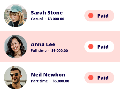
Manage payroll & employees
Create & send online invoices
Track & store employee expenses
See your business performance in real-time
|
Australian small business accounting that makes it easy to monitor your day-to-day income, expenses and cash flow with real-time reporting and a customisable dashboard for decision making. Monitor your business performance on the fly, track GST and prepare your BAS with precision. |
|
Pay your employees and simplify compliance
|
Easy to use payroll software for business owners, designed to stay compliant with all the latest changes from the ATO. Manage pay runs, leave, super and Single Touch Payroll starting from just $14/month for up to 4 employees, so it’s perfect for growing small businesses! |
 |
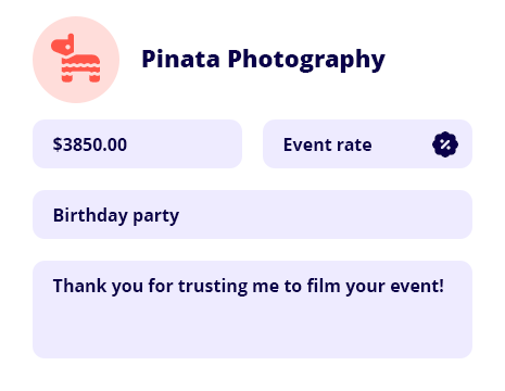
Get paid faster with unlimited online invoicing
|
Boost cash flow with professional invoices that include a ‘Pay now’ button for credit card payments. Time-saving features like recurring invoices, payment reminders and templates will shrink your to-do list and ensure you get paid on time. |
 |
Track expenses and stay organised for tax time with our accounting software
|
Track, manage and store business expenses and attach receipts to claims for approval or safekeeping at tax time. Mark expenses as billable and pass on the charges to your clients – so you’re never out-of-pocket! See where your money is being spent for better decision making. |
Plans that fit your business needs and your pocket

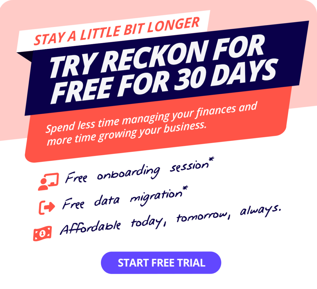
30-Day free trial

Cancel anytime

Unlimited users
† Free data migration offer includes 1 year of historical data + YTD only. Paid subscriptions only.
Helping thousands of businesses with their accounting
Small business accounting software comparison
A clever pricing system our competition can’t match.
$35PER MONTH
$29PER MONTH
$34PER MONTH
$22PER MONTH
+ $156 per year $156/yr
+ $84 per year $84/yr
+ $144 per year $144/yr
Best price! Cheapest
Create budgets
Track GST & manage BAS
Send unlimited invoices
20 invoices only
Cash flow reporting
Create and send bills
5 bills only
35+ financial reports
Automatic bank connection
2 account limit
Free onboarding session
Free phone support
Xero
Quickbooks
myob
Reckon
Data compared includes Xero's 'Ignite' plan, MYOB's 'Business Lite' plan, QuickBooks 'Simple Start' plan and Reckon's 'Accounting Plus' plan. Data correct as of March 2025.
See our in-depth accounting software comparison
MYOB | Xero | QuickBooks | Hnry | Freshbooks | Zoho | Rounded
More reasons to love Reckon One

Bank-level security
Your data is encrypted and protected with bank-level security.

Cancel at any time
Switch us off whenever you want. Your data is saved over a long term, 7 year period.

Automatic backups & updates
Your data is safe and you’re always on the latest, cutting-edge online accounting software.
Free data migration service
Our friendly team are here to assist you migrate your data safely

Data stored in Australia
Your sensitive accounting software data is stored here at home, under Australian law.

Connect with an expert
Your accountant or bookkeeper can now help your small business in real-time.

Get started with a free onboarding session
Sign up for a free trial today and kickstart your Reckon journey with a complimentary onboarding session from one of our product experts.
We’ll help you:
- Get up and running with a Reckon One overview
- Create and send invoices & add online payments
- Add employees and set up a pay run
- Add bank accounts & start reconciling
What our customers are saying

“Small business owners who are struggling with their payroll, get onto Reckon. It’s so simple to use and really reduces all of those manual tasks that are taking up your time.”
Taryn Levey
Maroondah Toy Library, NP

“We run payroll ourselves. That’s because the interface is fast, user-friendly, and makes sense. It has been able to grow with us, scale with us, and save us a lot of time and money.”
Shane Musarra
Dux Nuts, Entertainment

“I was never able to resonate with a software program that made sense to me that I could easily use. Reckon has been it for me. It’s all there, PAYG, superannuation, taxes, and it has simplified my payroll, taken hours of stress out of my life.”
Kate Scott
Ten Thousand Things, Retail
Frequently asked questions
How does the 30-day free trial work?
The Reckon One free trial allows you to try our accounting software for a period of 30 days to ensure it meets the needs of your business. After this period, your subscription will automatically convert to a paid one to avoid any interruptions to your data. However, if you find that Reckon One small business invoicing software is not suitable for your needs, you can cancel your subscription before the billing renewal date and your credit card won't be charged.
If life got in the way and you weren’t able to use your trial, no worries! Just give our friendly support team a shout and we’ll see if we can get you up and running again.
Can I change my software plan later on?
Definitely! Reckon One offers you the flexibility to change your plan to fit the unique needs of your business. Whether it’s downgrading or upgrading, you can easily make these changes right from your Reckon account.
How do I switch from another accounting software to Reckon One?
Making the switch to Reckon One from your current small business accounting software is a breeze with our data migration service!
Head to our data migration page and see how our free* migration service works.
What do I need to get set up with Reckon One?
There is no software installation required. All you need is a device with an internet connection to access your Reckon One account. Simply sign up for an account on our website and start using Reckon One to manage your business.
Is my data secure?
We use the best technology to ensure your data is safe and secure. Our accounting software for small business, Reckon One, is built with cutting-edge HTML5 technology and hosted on Australian servers powered by Amazon Web Services, a leader in cloud data storage.
Do you provide customer support?
We offer support through email, chat, and phone with our local team and resources such as webinars, a small business resource hub, and an online community to help you succeed from the moment you start using Reckon One.
Expert training is also available through the Reckon Training Academy or our trusted partners (accountants and bookkeepers).
Can I grant access to other people?
What are the advantages of using accounting software for small businesses?
Mobility
Online accounting software like Reckon One gives you the flexibility and mobility to manage your finances from any device. Gain clarity over your business’s financial position, automate your accounting process & reduce data entry, track business transactions, get paid faster, and more.
The latest version
Our small business accounting software Reckon One is automatically updated in the cloud. So you’ll always use the latest version without having to manually download compliance updates and accounting features.
Cost-effective
Reckon One pricing works on a SaaS (software as a service) pricing model. So you pay a low monthly fee instead of a large upfront payment for your software license. Paying month to month also means you aren’t locked into a contract and can cancel anytime.
Security
Your data is safely stored in the cloud so you won’t be affected by theft or accidents to physical hardware. All data servers have 24/7 security and several layers of encryption.
Is there a minimum subscription period?
Enjoy the benefits of Reckon One with the flexibility of monthly payments and if you decide it's not the right fit for your business, you can easily cancel at any time.
Add more to your accounting software
Our add on marketplace is full of third-party app integrations that extend the power of your accounting software.
Try Reckon One free for 30 days
Cancel anytime. Unlimited users.